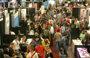
As you saw in last week’s post, I attended Quirks-New York this year – a really good event, by the way, if you’ve never been. Coincidentally, part of my background includes the development, management and marketing of conferences and trade shows all across the United States. And in the 30+ years since I was in that industry, nothing much has changed on the exhibit floor. Exhibitors are still making the same stupid mistakes now that they did back when I produced events! And at all stages of the process…
Before
Simplify your marketing message. A few of the booths I walked by at Quirks had eye-catching graphics and a simple, direct message. But only a few!
The majority tried to list every product and every service they provided on their display. First of all, from a design perspective, it just looks lousy. All those words crammed into a relatively small space. Remember, there’s nothing wrong with ‘white space.’
But more importantly… people don’t care about what you can do, they only care about what you can do for them! So, instead of listing out 25 different services (a list – by the way – that not a single attendee will read)… craft a ‘general benefit statement’ or a ‘unique value proposition.’ Tell attendees how you’re unique, the kinds of problems you solve or the types of companies you help.
Think of it this way… as someone is walking by your booth, in the 2 to 3 seconds when they peek at your display, you need to answer the question they’re asking themselves, which is, “Why should I care about what this company does?” If your display is not answering that question, it’s time for a new one.
During
Get rid of the fu**ing chairs! The majority of booths at Quirks had an 8-foot table at the front of their booth space and behind that table were chairs. And what do you do with chairs? You sit in ‘em!
But when you do that, as an exhibitor, you look bored and uninterested… a look that certainly won’t attract any passers-by. Further, if you’re sitting behind the table, you’re likely working on your laptop (or cell phone)… which says to everyone watching, “I’d rather be anywhere than here.”
So, get rid of the chairs. If you get tired or need to check email, take a break in one of the coffee areas or in the lobby of the building… just not in your booth. Better yet, once you get rid of the chairs, move that table to the back or the side of your space (removing that ‘barrier’) and then stand at the front of your space, ready to engage people.
After
Follow-up. While I didn’t see this mistake happen, I absolutely know for certain that it did… most of the leads gathered by exhibitors were not followed-up on! As many as 90% of them, based on some studies.
I understand how it happens… you finally get back to the office after a week away at a conference, only to be met with lots of unopened emails, some voicemails, a boss that wants a recap of the event, a bunch of meetings and a couple of client projects that went sideways. And those sales leads suddenly become a lower priority. Eventually, they get pushed to the back of a desk drawer and forgotten about completely.
The only way this can change is for you to prioritize the qualifying and following-up of those leads as the single most important thing you can do once you get back to the office. No exceptions! And not just one email follow-up… but a series of well-timed touchpoints to help you connect with each booth visitor.
Summary
Let’s recap… a lousy display, poor in-booth presence and no follow-up. And then you complain that the event was “no good.” If that’s your response when your boss asks you about an event, look in the mirror. How did you handle the before – during – after?
And while not all events are ‘winners,’ when I hear someone say an event wasn’t very good, it’s most likely because they didn’t do a good job of being an exhibitor.
With exhibit fees, booth costs, travel, lodging, meals, etc., exhibiting at a conference is likely the most expensive item in your marketing budget. If you’re gonna do it – do it right!

